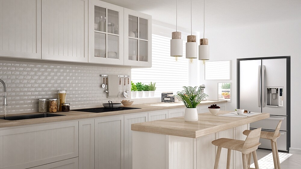
If you are wondering how you can bring more space, more charm, more trend or more colour into your kitchen: we have some very effective makeover inspirations for you.
1. How much color can my kitchen take?
A lot! It is important that a strong colour is contrasted with a maximum of two more, more neutral colours. Exception: natural tones – here you can choose according to your mood. A beautiful but more expensive alternative to coloured walls: coloured fronts for cupboards. Here, too, the following applies: limit to a maximum of three tones. And it looks most noble when they come from one colour family.
2. How to make my kitchen more homely?
By furnishing the kitchen as a living space rather than a functional space. A good tip: do without wall units completely. The base units run along the entire length of the room, offering plenty of storage space in which all the all-too-practical things disappear. The top is decorated as on a sideboard in the living room – with accessories such as pictures or sculptures.
3. Aren’t colorful chairs too childish?
What! Modern, classic or country house: All styles are now part of the colorful trend. A small downer: Good chairs have their price, but are still cheaper than a new kitchen, and with two, the kitchen gets going.
4. How does the hip industrial look work?
With the simple formula ‘cool metal + warm wood’. It doesn’t have to be a whole row of stainless steel, individual modules are also very impressive. Add stainless steel and aluminium accessories and a sturdy worktable made of untreated wood, and you have the look. Also noble: black kitchen fronts combined with black industrial lights, cast-iron pots, a vintage locker from the dawdler and iron chairs. And everything may look a little ‘scrambled’!
5. Are striking tiles suitable for kitchens?
Absolutely! Because coloured tiles give even plain kitchens a special touch. Shouldn’t it be the whole wall? As a splash guard behind the stove or sink, they set beautiful accents, and then even luxury models don’t cost as much.
6. How to design a kitchen in XXS?
Like a jewel case! Because where many things come together in a small space, you have to choose the most beautiful ones. In concrete terms: Unattractive packaging is put in the cupboards or its contents in pretty containers. Choose matching mortars, spice mills and other utensils.
And if you paint the walls in the same colour as the wall units, they will blend together visually and not look too bulky. For the worktop, we recommend glossy surfaces that conjure up depth in the room through their reflections.
7. And how does my kitchen look tidier?
Clear lines help! Modern, cubic kitchen systems with smooth fronts without handles provide visual peace and quiet and automatically appear more ‘tidy’ than those with decorative strips or curved shapes. Also practical: a ‘multi-functional wall’ in which, in addition to wall lights, various brackets can be hung, for example for herb pots, knife block or kitchen roll. The effect: everything has its fixed place and does not spread out on the worktop.
But quite honestly: there’s still no getting around tidying up or mucking out. And here again – logically – sufficient storage space helps. However, this does not necessarily mean huge drawers, but rather cleverly structured elements that divide the available space as economically as possible.

